By Sara Pocius · Published October 2026
Open Meegan & Tobin’s FYC page and scroll for a minute. There are colored pull quotes, dividers inspired by the colors of the album cover, a bio with three separate photos beside it, and a wall of credits with tiny headshots. It doesn’t look much like a typical ReelCrafter reel.
But you can build every part of it in the ReelCrafter reel builder. Some parts use advanced blocks that come with the Professional plan, and a few blocks are doing jobs they were never designed for.
I built this FYC reel in 2025 for their Grammy campaign, together with the artists and their publicist. It started as an experiment at ReelCrafter to see if one of our pages could meet an awards publicist’s standards. Below, I walk you through the reel section by section and show the settings I used, so you can build your own version on the Professional plan.
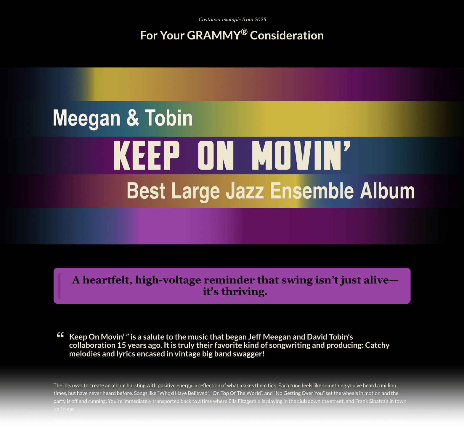
This FYC reel goes further than most ReelCrafter reels. You don’t need custom HTML or custom artwork to build an effective FYC page. These are just the techniques I used to give this album its own look.
The page at a glance
Here’s the whole page from top to bottom. Between each section, there’s a spacer, a thin banner used as a divider, and another spacer.
| Section | Blocks used | What to notice |
|---|---|---|
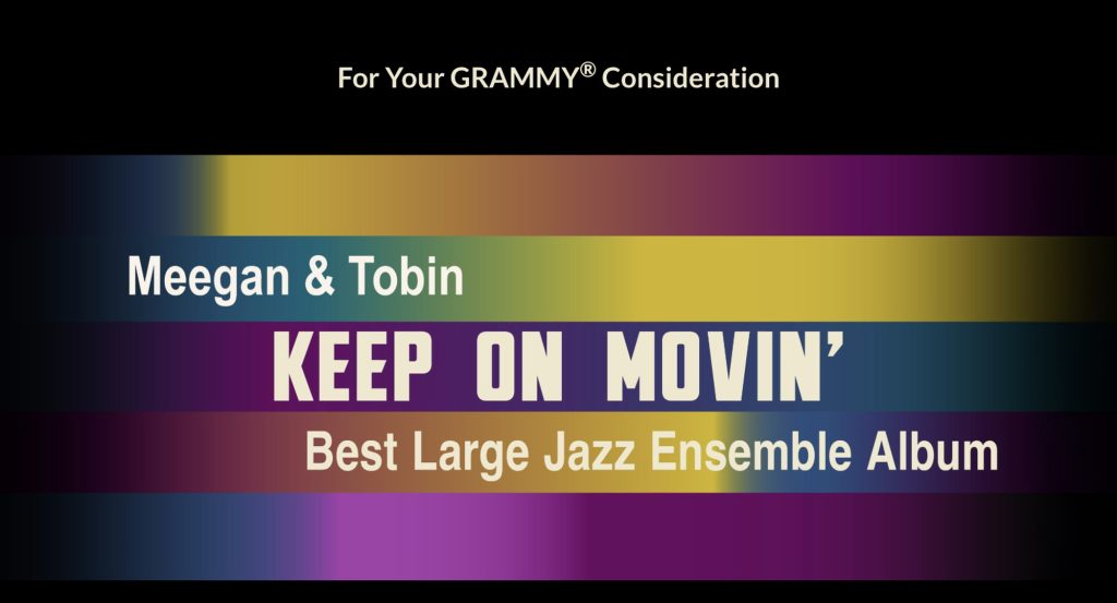
| Header | Spacer, text block, spacer, banner block | “For Your GRAMMY® Consideration” sits in its own text block with space around it. The banner is the album cover, extended into a wide image, with the exact Grammy category added. |
| The album’s story | Two text blocks | A large purple pull quote made with custom HTML, then the album description with a built-in pull quote. |
| The duo | Biography block, text block | A tall image made to match the height of the bio, then another custom quote in a new color. |
| Listen | Text block, media block, button block | A centered “Listen” header, one playlist with a note on every track, and a button to stream the album. |
| Reviews | Text block | Built-in pull quotes, with each quote in italics and the reviewer’s name in bold. |
| Artist bios | Biography block, text block, biography block | Headshots on opposite sides, with a bright callout for Jeff’s Daytime Emmy between the two bios. |
| The making of the album | Two text blocks, video gallery, image gallery | Three session videos above three tall session photos, in matching three-column grids. |
| Credits | Text blocks, image gallery, credits block | Small headshots with names and roles, then a text list of every other player, engineer, and studio. |
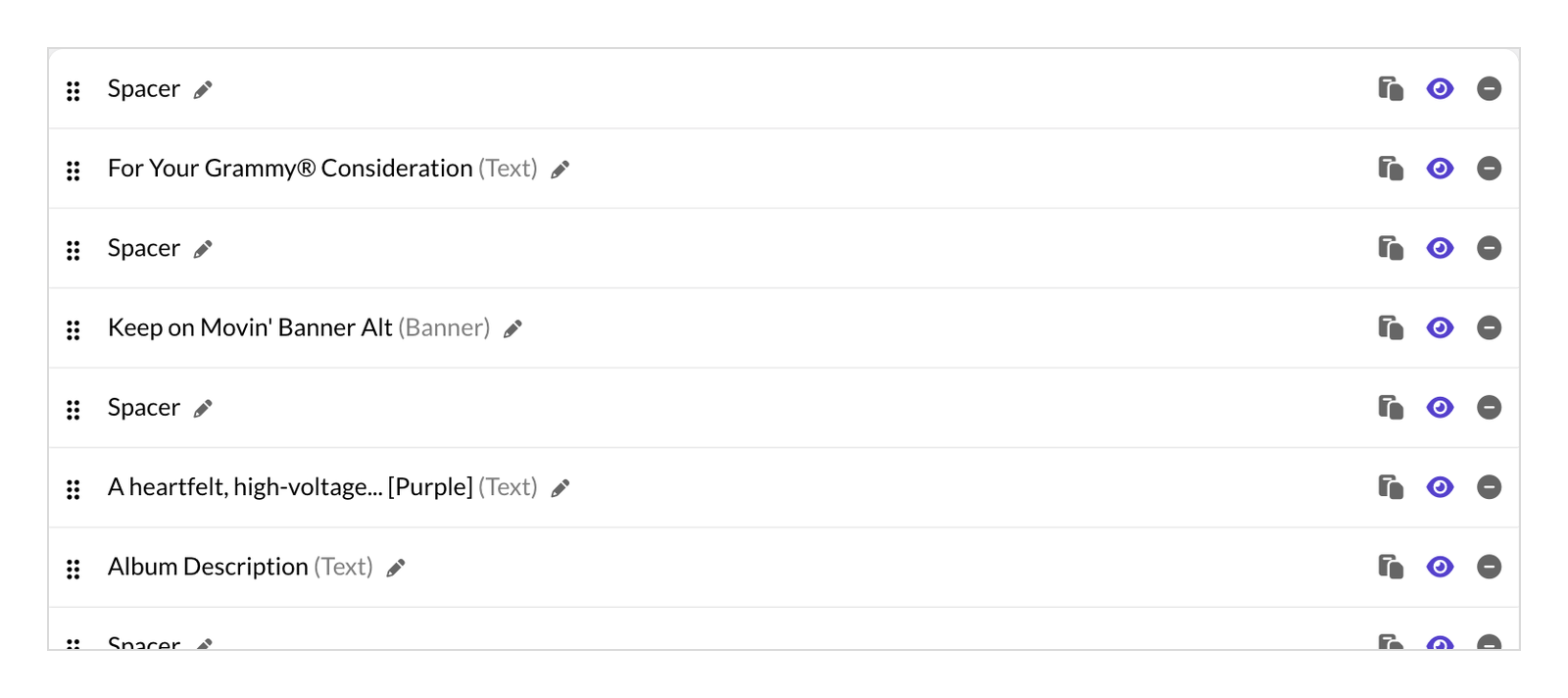
With this many blocks, name them from the start so you stay organized. A renamed block shows its original type in parentheses in the builder, so “Purple quote (Text)” tells you what it is without opening it.
Give the page room to breathe
The very first block on the page is a spacer. If your reel opens with a banner, it’s fine for the image to touch the top of the page. This one opens with text, and text needs some air above it.
Next comes a text block that holds “For Your GRAMMY® Consideration,” then another spacer. Check the rules for your award before you write this line. For the Grammys, GRAMMY goes in all caps with the ® symbol, and you can’t include the category number, only its name.
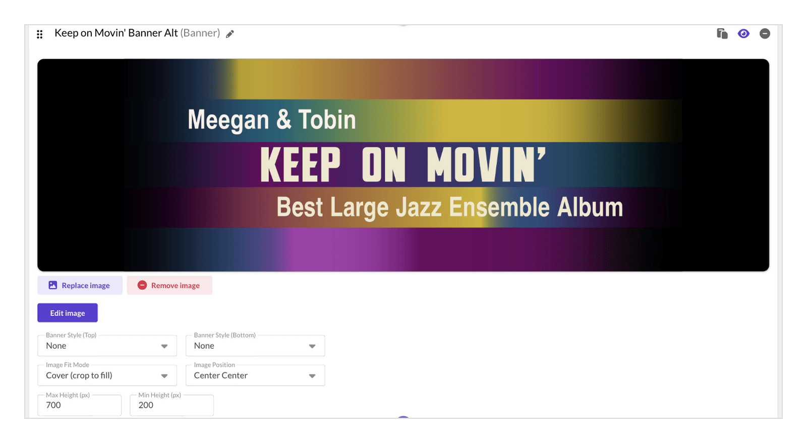
The banner comes next. It starts with the album cover, which already had the artists’ names and the album title on it. The cover is square, and a square would look a little lonely floating at the top of the page. So I extended the artwork out to the sides and added a gradient that fades the edges to black. On most screens, it reads as a wide banner. On very wide screens, the edges fade into the page background.
I also added the exact Grammy category, Best Large Jazz Ensemble Album. The banner is set to cover and centered, with a maximum height of 700 pixels and a minimum height of 200 pixels.
There are no perfect numbers for those settings. They depend on your artwork and where the text sits in it. I tried a few heights until I found settings that look good on wide and narrow desktop windows and on most phones. Our help doc on banner image sizing and display settings explains each one.
Use custom HTML for pull quotes and callouts
The big purple pull quote near the top isn’t a built-in ReelCrafter style. It’s a text block with a few lines of custom HTML that set the font, size, background color, text color, and rounded corners. The same trick makes every colored quote and callout in this FYC reel.
Here’s how to do it:
- Open a text block and click the code button.
- Paste your HTML and click Commit Changes.
- Always check it with Preview Draft. The text editor can look slightly different from the finished page, because the editor renders your HTML in a different space than your final presentation page. What matters is how it looks on the page, not in the text block.
- Adjust the code and preview again until it’s right.
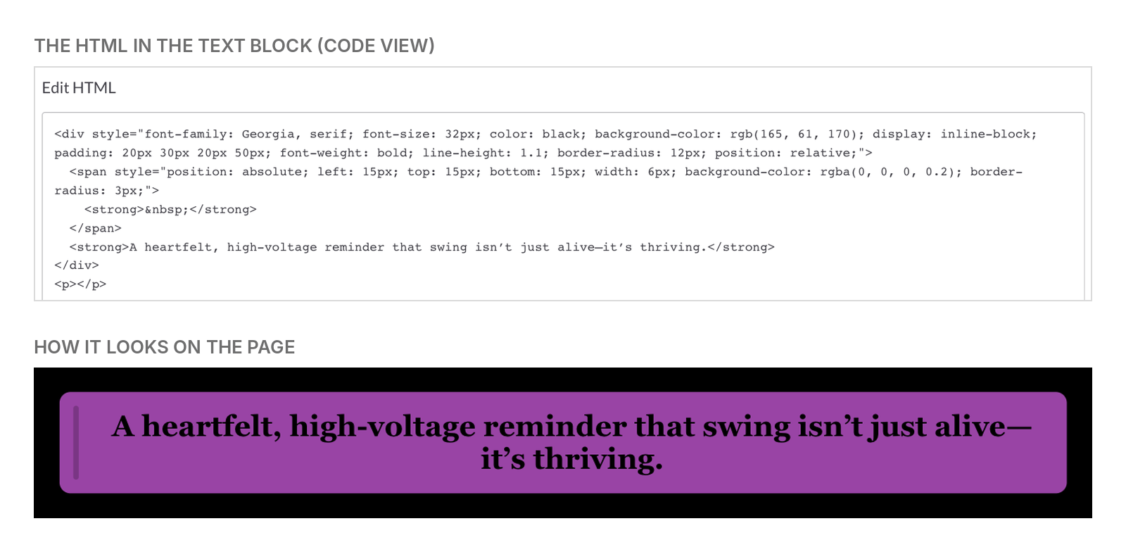
Keep your HTML simple. Text blocks accept basic HTML with inline styles only, and they remove any scripts, so interactive code won’t work. The simpler the code, the better it holds up.
To skip a step, start from this template. Open the code view of a text block, paste it in, and replace the quote and the name with your own.
<div style="font-family: Georgia, serif; font-size: 28px; font-weight: bold; line-height: 1.2; color: #000000; background-color: #A53DAA; padding: 20px 30px; border-radius: 12px; text-align: center;">
  Your quote goes here.
  <div style="font-size: 18px; font-style: italic; text-align: right; margin-top: 10px;">— Reviewer Name</div>
</div>
To change the box color, replace #A53DAA with any hex color code, like one you pulled from your artwork. To change the text color, replace #000000. If you don’t need a name under the quote, delete the line that starts with the second <div.
If you want a different look and don’t write HTML, you have options. You can follow an online tutorial, ask a friend who knows HTML, or describe what you want to an AI chat tool like ChatGPT or Claude. For example: “Using inline styles only, make a box with a dark blue background and large sans-serif text that says…” Paste the code it gives you, preview the reel, then send it a screenshot and say what to change. That’s how I got these quotes looking right.
For fonts, you can stick with the fonts you’ve already set for the reel. If you want a callout to look a little different, use a standard web font that almost every browser supports, like Georgia. Search for “web safe fonts” to find a list.
Bend blocks to do new jobs
Several blocks in this FYC reel are doing something other than their usual job.
Banner blocks as dividers. The dividers between sections are inspired by the colors of the album cover. Each one is a very wide, very thin image, placed in a plain banner block with no special settings. The banner keeps the image centered, so it reads as a line. Each divider in this FYC reel has its own color gradient, but you don’t have to get as fancy as I did. Using the same divider every time works fine too.
A biography block with three photos. A biography block usually holds one headshot and a short bio. In this FYC reel, it holds the duo’s long bio next to what looks like three separate images: a photo of the artists, the album cover, and another photo. It’s actually one tall image in the headshot spot. Each part fades into the same black as the page background, so they read as three images. A single horizontal photo would have sat at the top of this long bio with empty space below it. On a phone, the image and the bio stack.
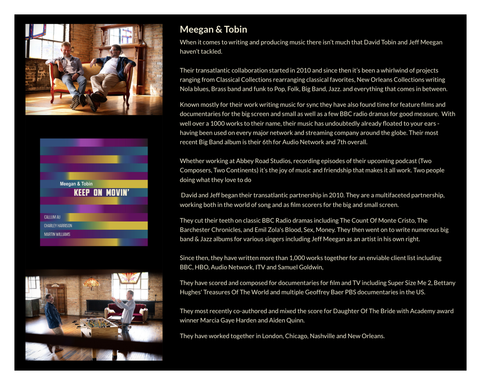
If you’re using the biography block for a lot of text, add your text first and preview it. Then you can see how tall your image needs to be. A long bio needs a tall image. A short one looks better with a square or horizontal photo.
I use Adobe Photoshop for this kind of artwork, but Canva or Adobe Express work too. To match a color from your reel, copy its hex code from your theme settings into your design tool. You can also work the other way: add your artwork to the reel first, then generate your theme colors from that image. Either way, use the exact same hex code for the background in your image and in your theme. That exact match is what makes the image blend into the page.
The biography block also has a built-in toggle that puts it on a shaded background instead of the regular one. I left it off in this FYC reel. If you turn it on and want the image in the headshot spot to blend into the shaded background, you need the exact hex code of the shaded color. That color isn’t listed in your theme settings, because ReelCrafter calculates it from your background color. The easiest way to get the hex code is to open your preview in Chrome and use a color picker extension to sample the shaded area. Do this after you’ve chosen your final background color, and sample it again if you change it. If that sounds like too much, leave the shading off and match your theme’s background color instead.
Biography block hack: In this FYC reel, the biography block still holds a bio. I only changed how the headshot spot works so it fits a long bio. But just because a block is called the biography block doesn’t mean it has to hold a biography. If a magazine featured you, put the cover in the headshot spot and a quote from the article in the text area. Now it’s a press callout.
Just because a block is called the biography block doesn’t mean it has to hold a biography.
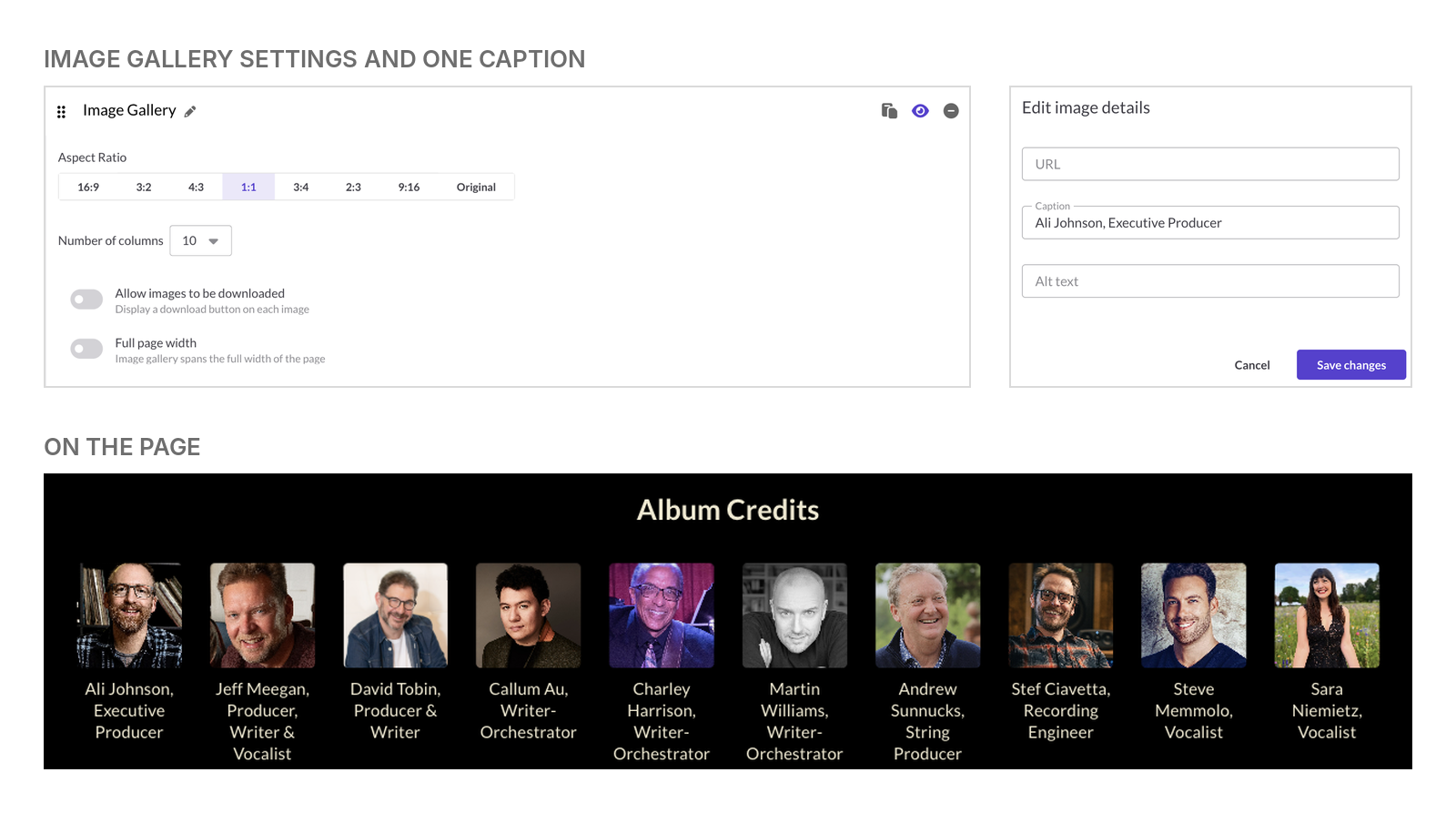
An image gallery as a credits wall. The main players appear in an image gallery set to 10 columns with square 1:1 images. Each caption holds the person’s name and role, so on the page it reads as a grid of small headshots with names underneath. It’s much more interesting to look at than a long block of text, and it gives credit to the people who were most important to the project. This works best if you can get a headshot from everyone you want to include.
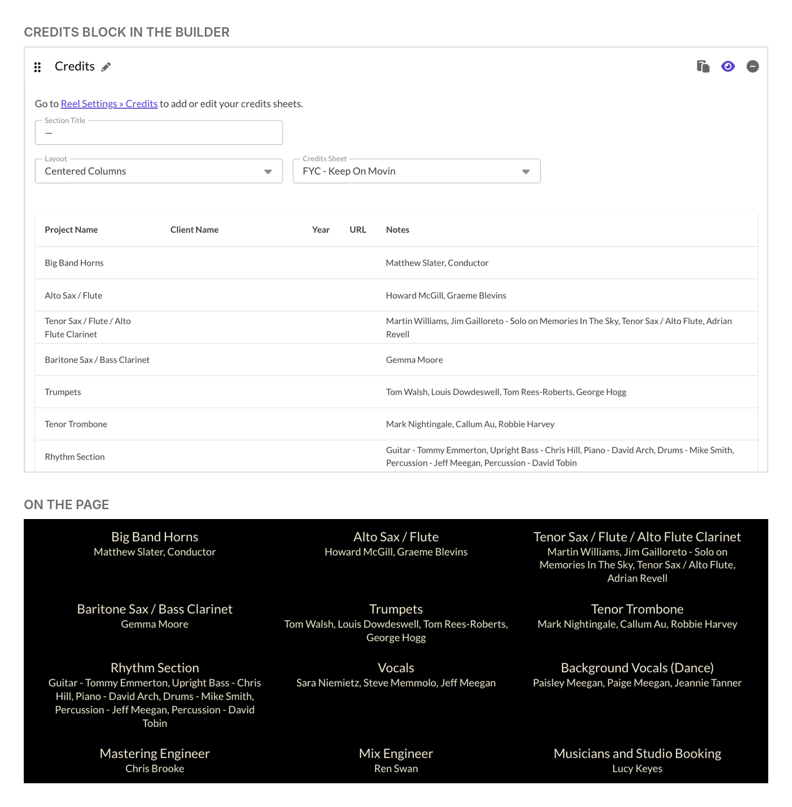
A credits block that lists musicians. If you have a lot of credits to list, or you don’t have headshots for everyone, the credits block works well and it’s flexible. It’s on the Professional plan and has fields called project name, client name, year, URL, and notes. You can choose to show or hide those column names on the reel. If you hide them, you can use each field for anything you want. In this FYC reel, I hid the column names. The project name field holds the instrument or role, and the notes field holds the names. On the page, each role appears in larger text with the names below it.
Keep the music section simple
Playlist titles sit on the left, above the tracks. I wanted “Listen” centered over the whole section, so it lives in its own text block. Under it is one media block with a single playlist of all eight tracks.
Every track has a track note with a short line about its mood or inspiration. For a film, TV, or game score, use that note to describe the scene the cue plays under.
This FYC reel uses the standard waveform. On the Professional plan, you can pick a custom waveform style that fits your project. After the playlist, a “Link to stream” button goes to the album on Spotify. Buttons use your theme’s text color, so this one matches the cream text on the page.
Pace the page like a story
This FYC reel holds a lot of information, so a few small decisions keep it easy to read.
- Spread out the big quotes. Save the large colored pull quotes for the lines you don’t want anyone to miss, and place them throughout the reel. They add color to the story as people scroll. The rest of your press quotes can live together in one place, like the Reviews section in this FYC reel.
- Keep spacing consistent. Every divider in this FYC reel has a spacer above it and a spacer below it.
- Change sides. Jeff’s headshot sits on the right of his bio, and David’s sits on the left. I also changed each section title from the default “Biography” to “About Jeff Meegan” and “About David Tobin.”
- Pull colors from your artwork. In Edit Theme for this FYC reel, the purple for the primary and link colors comes from the stripes on the album cover, and the cream text color comes from the album title. The background is black. You can choose custom fonts there too.
- Give the details a spotlight. Facts like “recorded at Abbey Road with live musicians, no samples” get noticed in a colored callout. In a long paragraph, people miss them.
Build a page that doesn’t look like everyone else’s
The pull quotes, dividers, bio photos, and wall of credits make this FYC reel look like it was custom-built for one album. But it’s all made with blocks in the ReelCrafter reel builder: text blocks, banners, galleries, and a lot of spacers.
You can build the same kind of page for your own score or album, whether it’s for an FYC campaign, a press kit, or your next pitch.
Start your free 14-day trial of the Professional plan and build a page that looks as carefully made as the music on it.
Common Questions About Building an FYC Page on ReelCrafter
Which ReelCrafter blocks were used to build the FYC page?
The page uses spacer, text, banner, biography, media, button, video gallery, image gallery, and credits blocks. The colored pull quotes and callouts are text blocks with custom HTML, and the section dividers are thin images in banner blocks.
Can I add custom HTML to a ReelCrafter reel?
Yes. Open a text block, click the code button, paste your HTML, and commit the changes. Text blocks accept basic HTML with inline styles only, and scripts are removed. Always check the result with Preview Draft, because the text editor doesn’t always show custom HTML exactly the way the finished reel does.
Which ReelCrafter plan do I need to build a page like this?
The example page was built on the Professional plan. It uses advanced blocks, like the credits block, that come with that plan, and the Professional plan also lets you choose a custom waveform style.